Figma, Sketch, Google Workspace, Abstract, Optimizely, Google Analytics/Firebase, Jira & Confluence
Overview
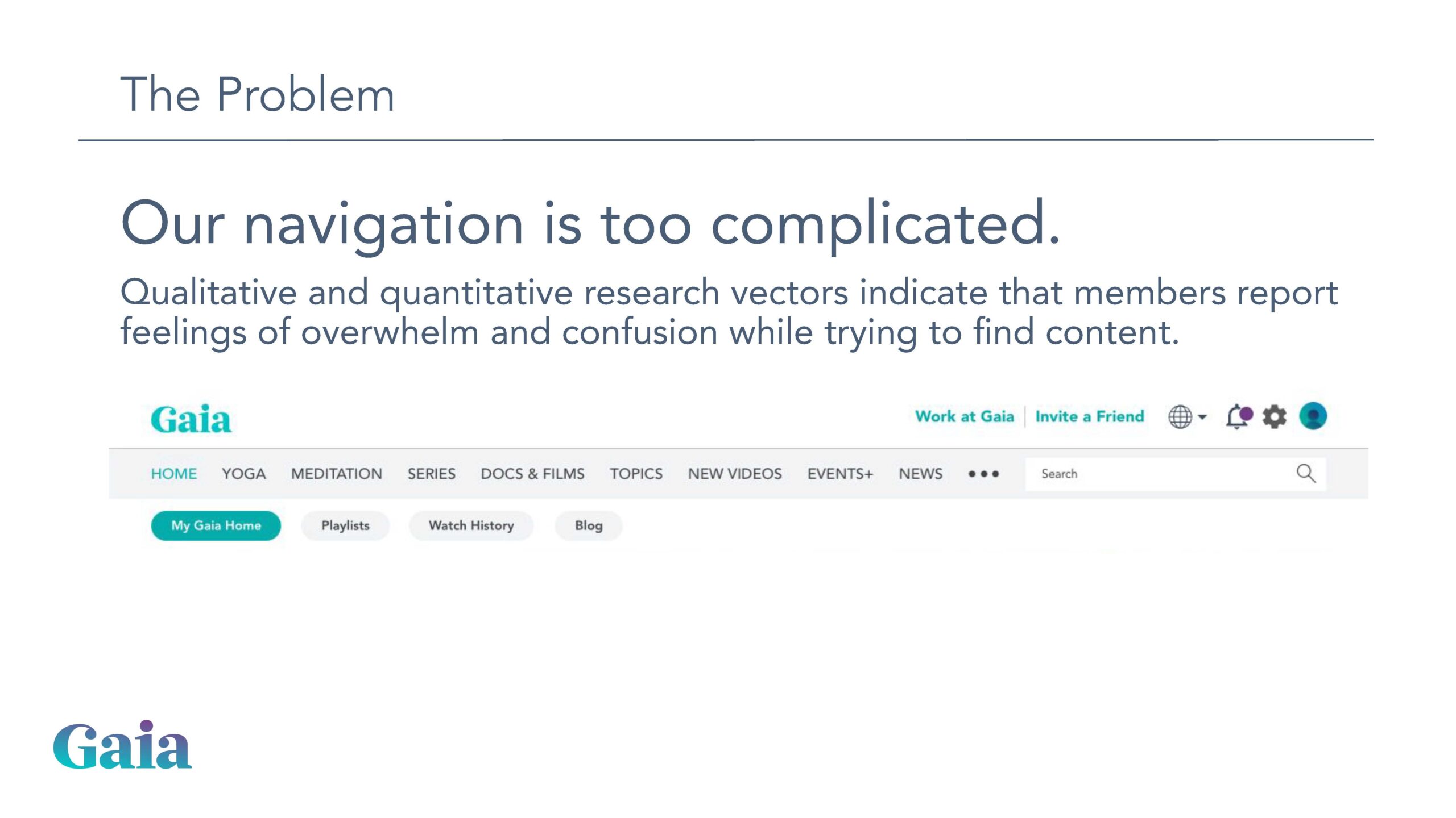
After record growth and member adoption in 2020, Gaia began to see video view metrics begin to drop. Through user research surveys and interviews, we learned many members were having a lot of difficulty “finding something to watch.”
Discovery & Research
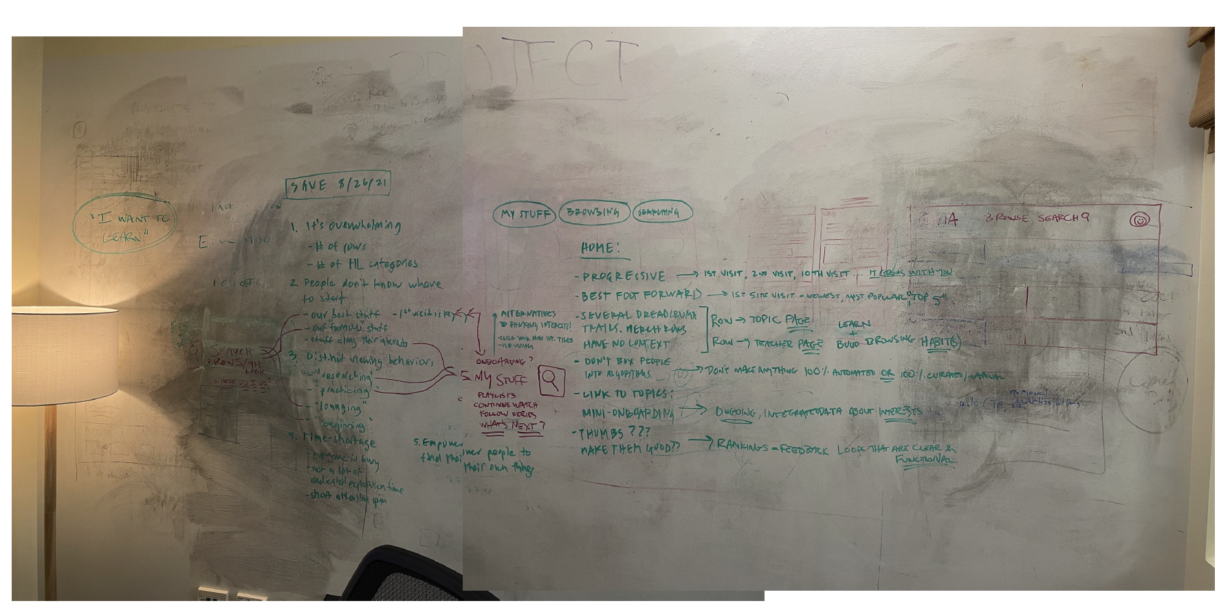
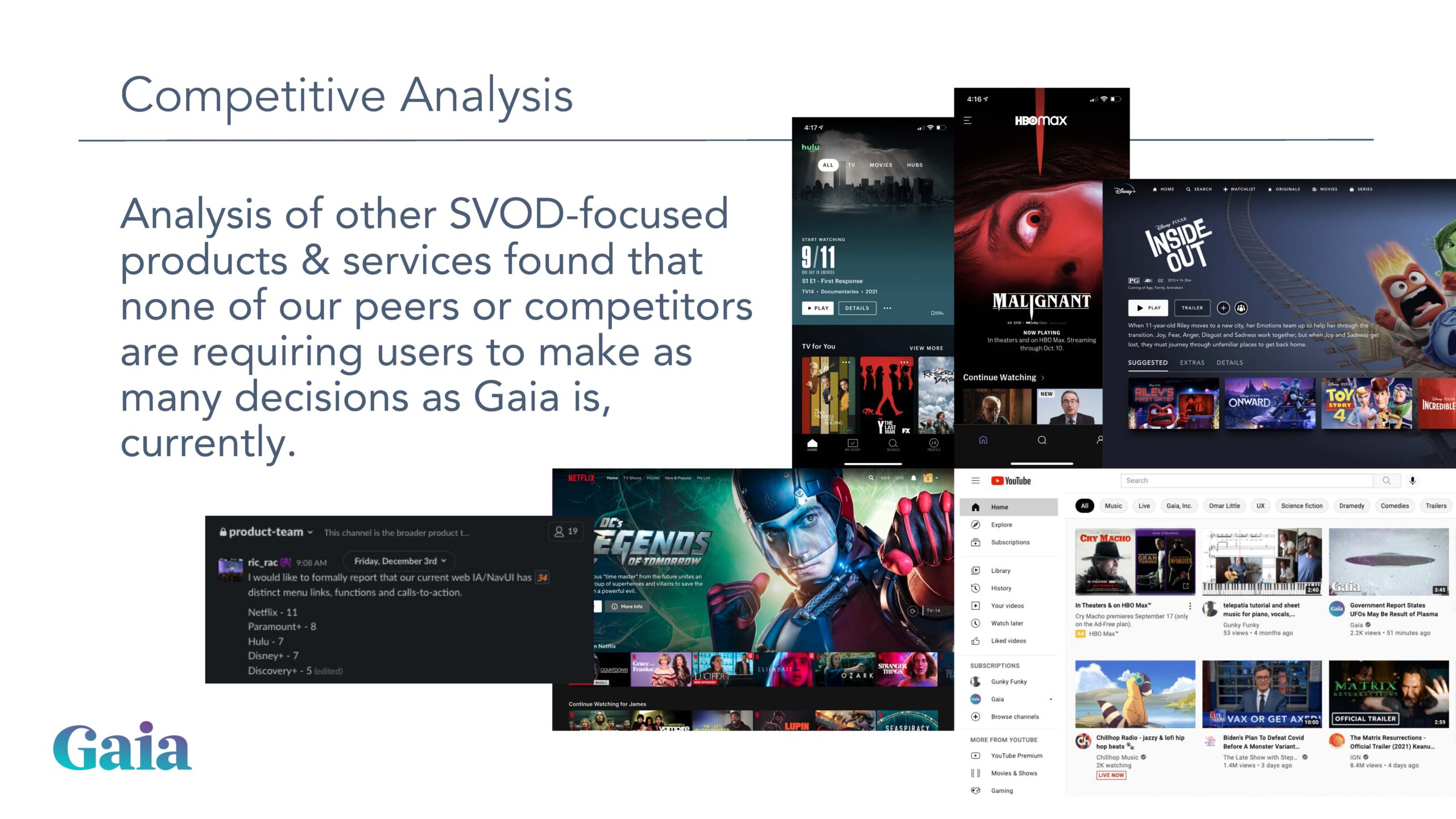
Our team was already aware of the problems our users were experiencing, so we proactively began collaborating with product management to analyze the problem.
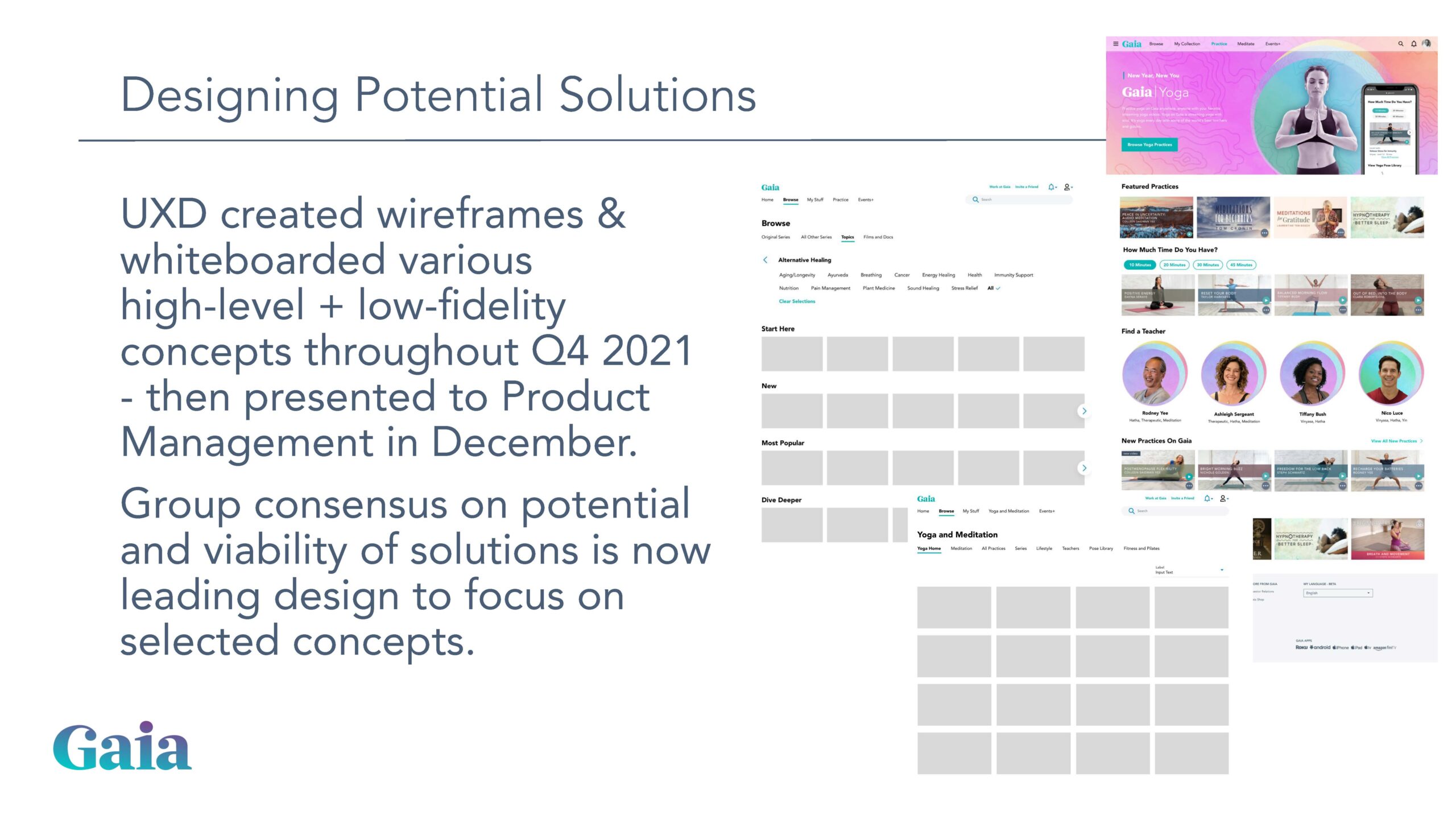
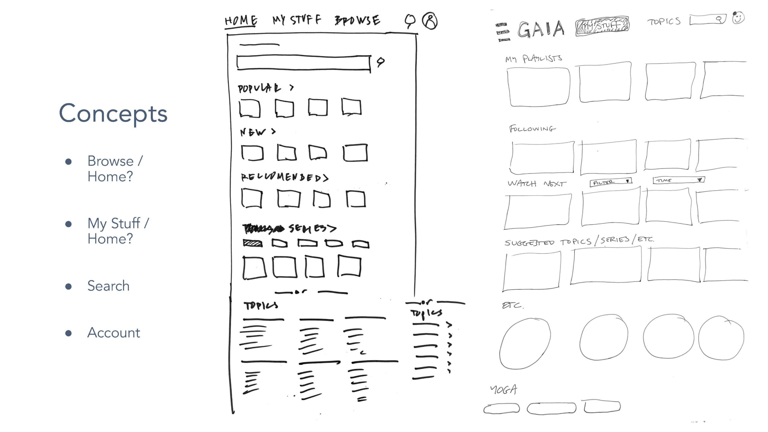
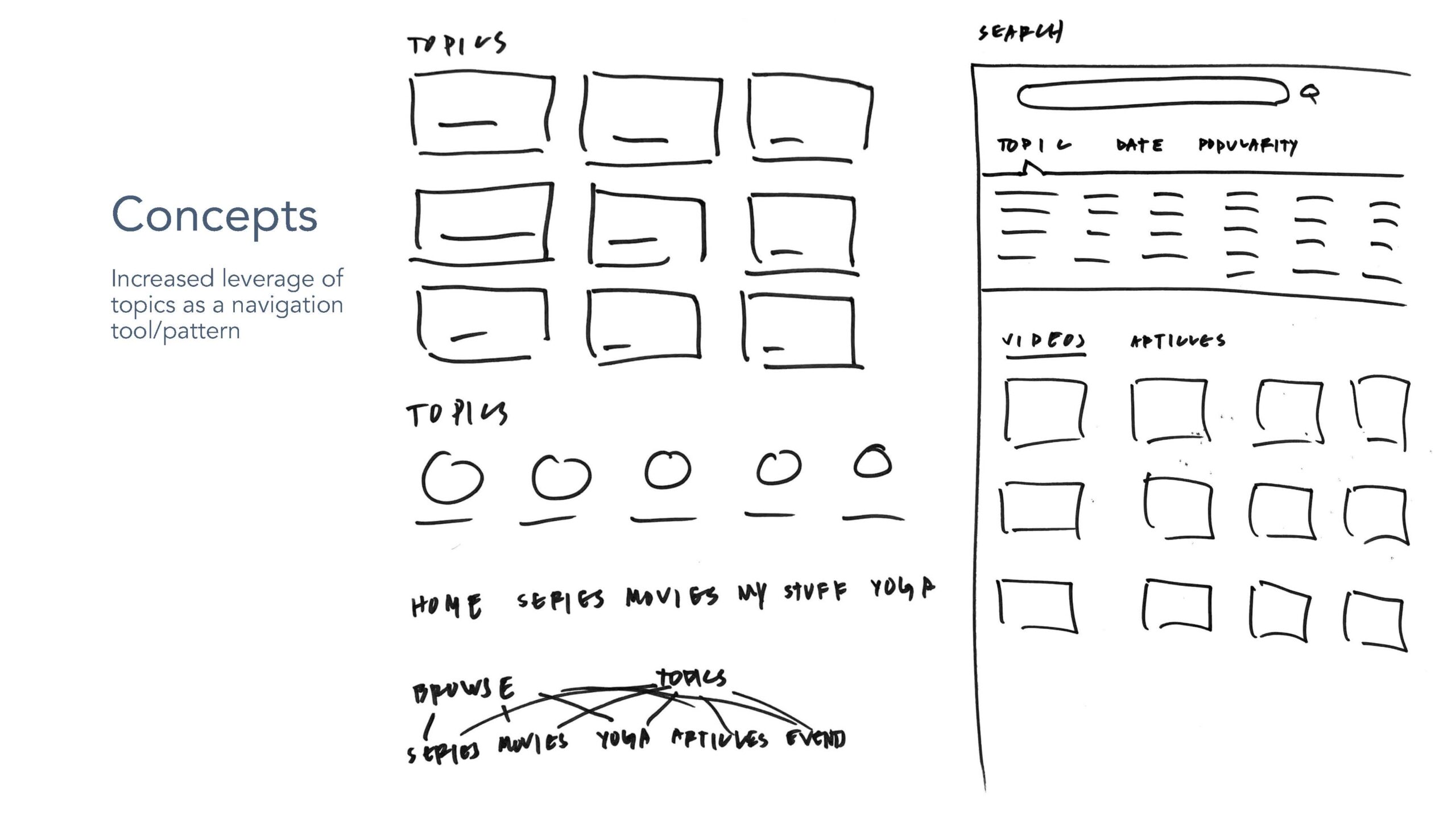
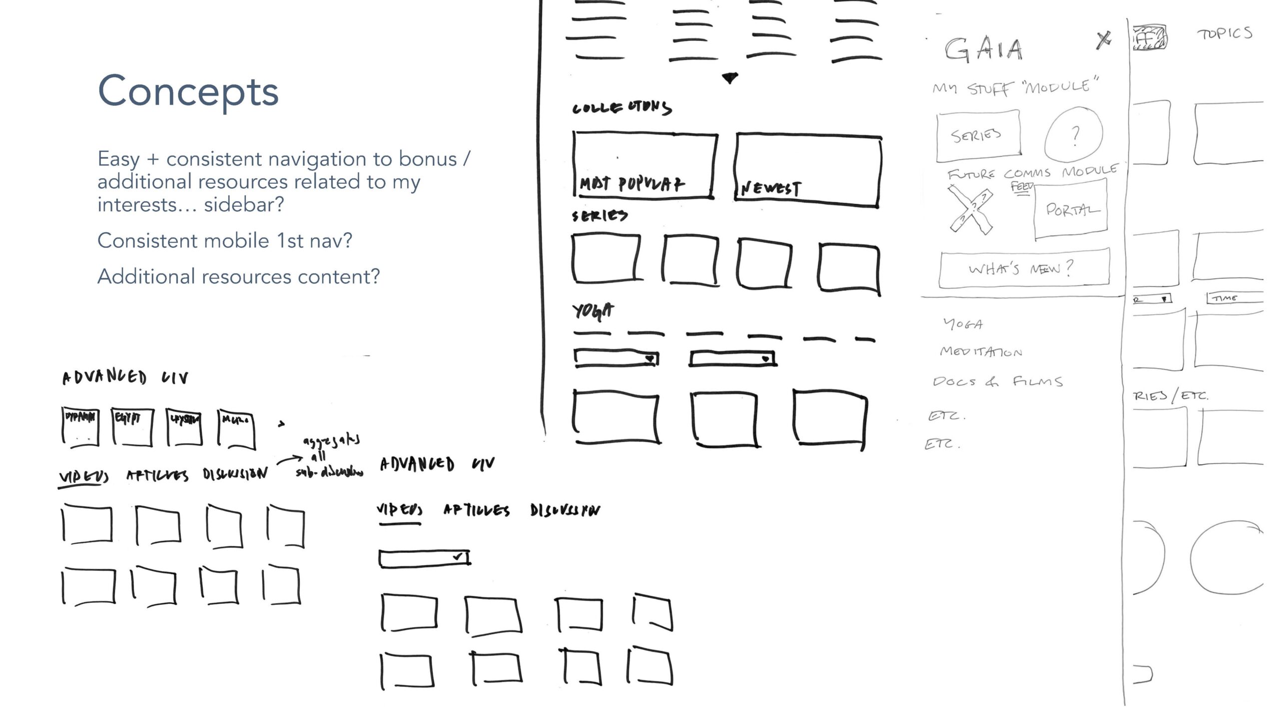
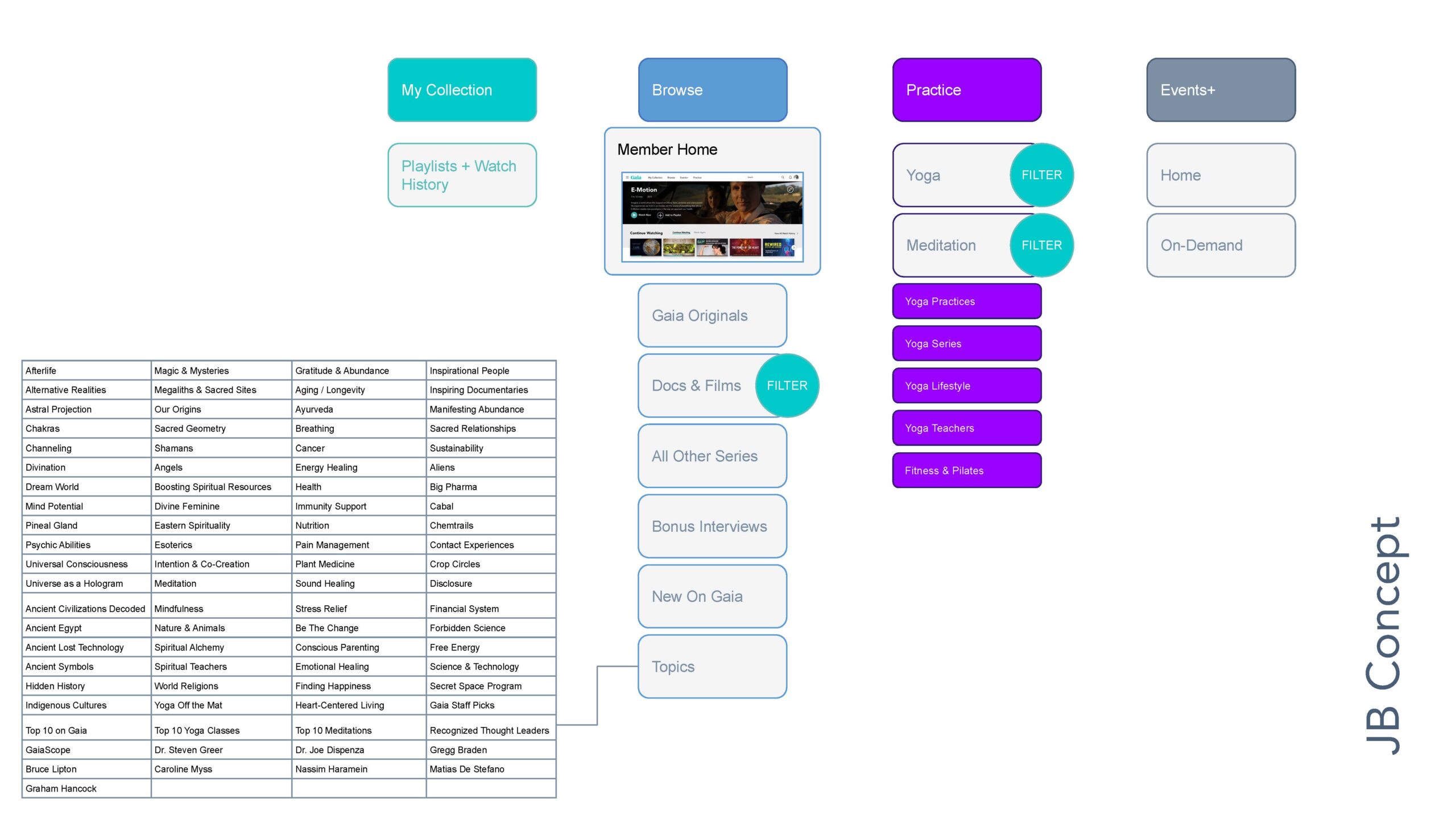
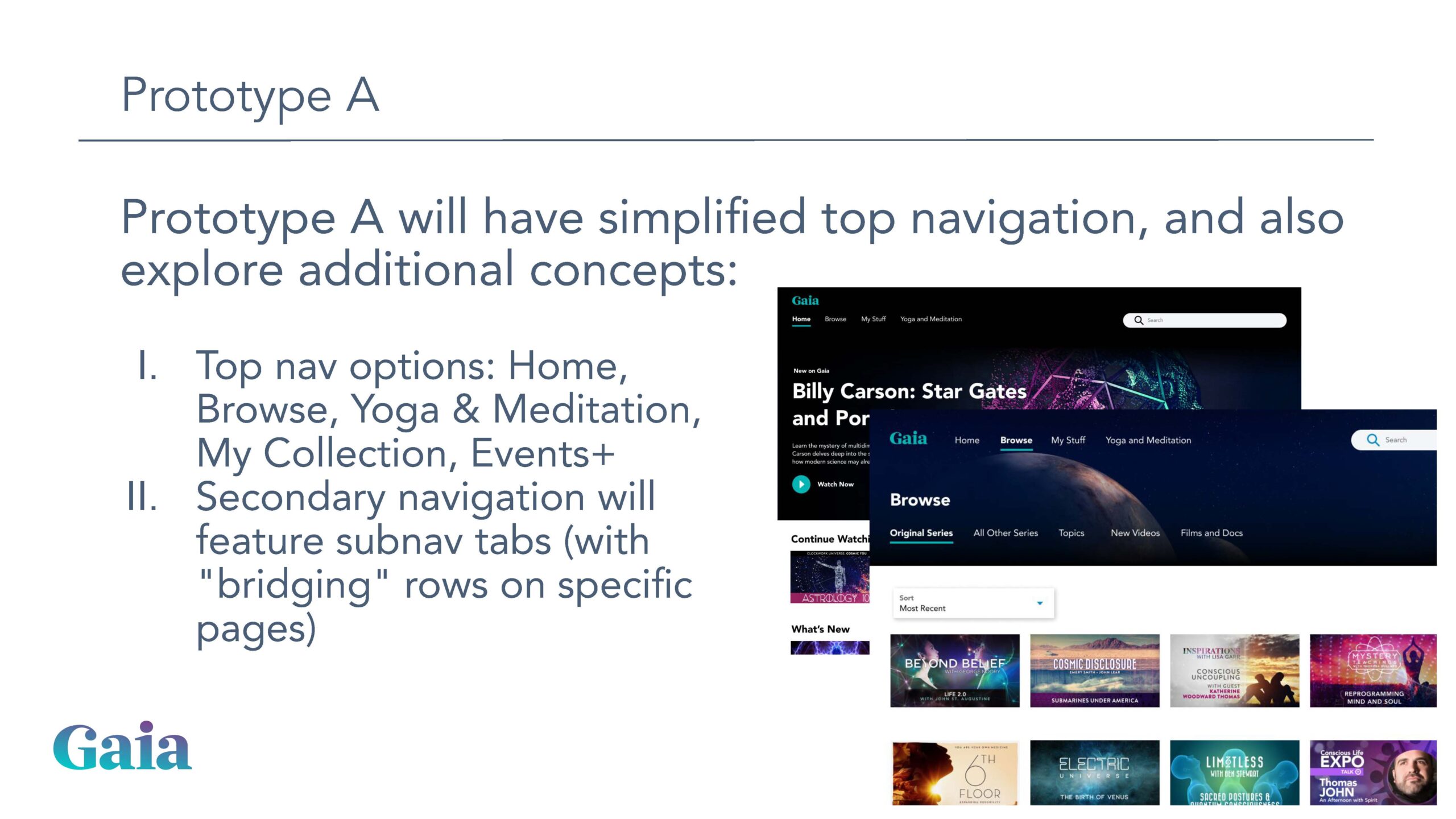
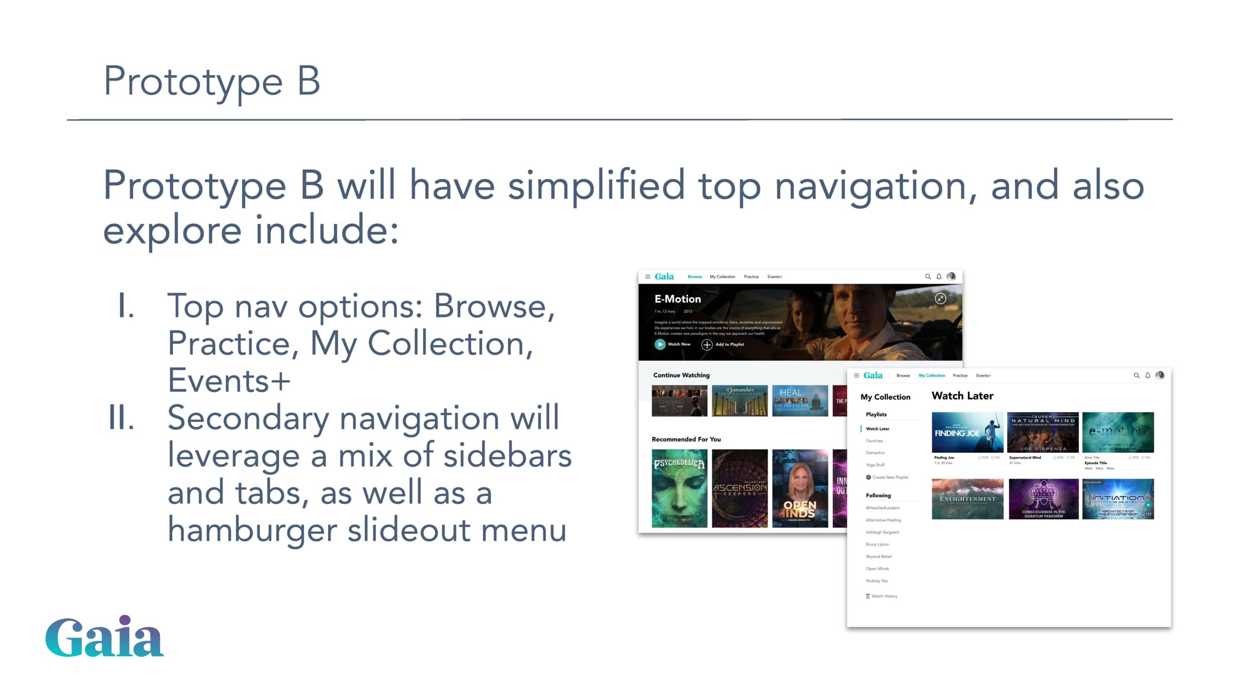
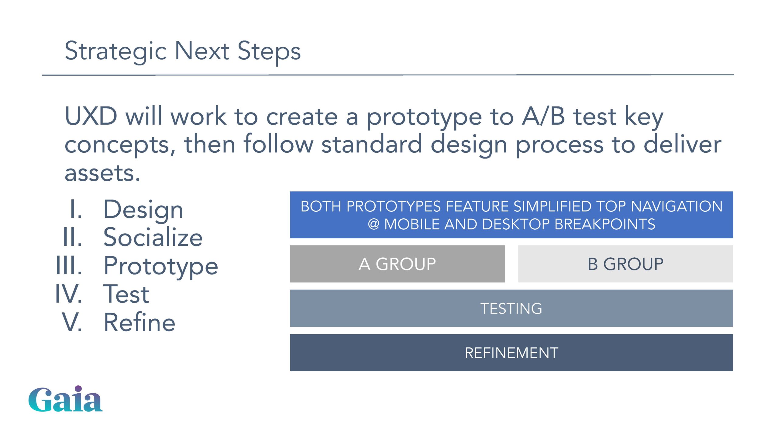
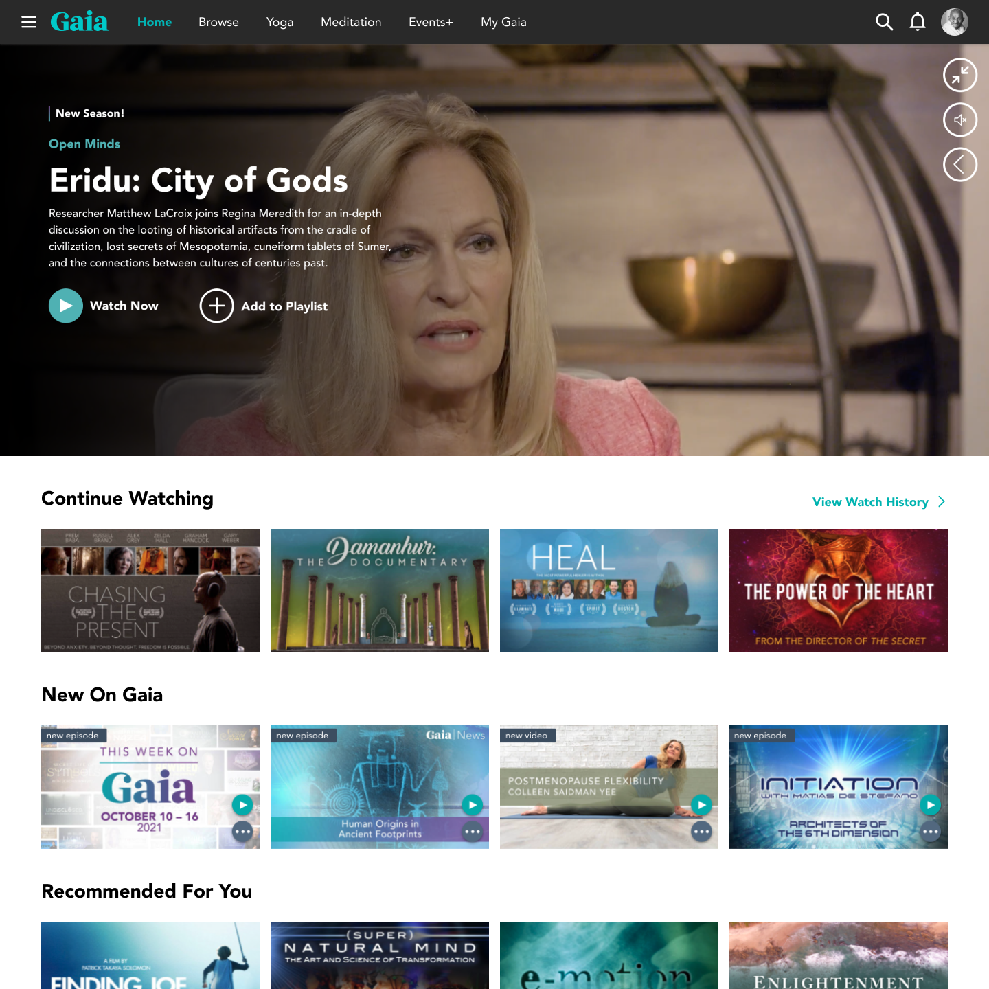
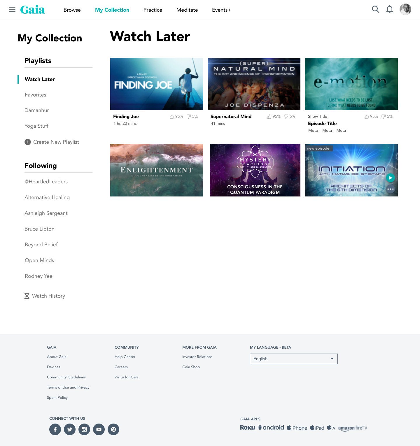
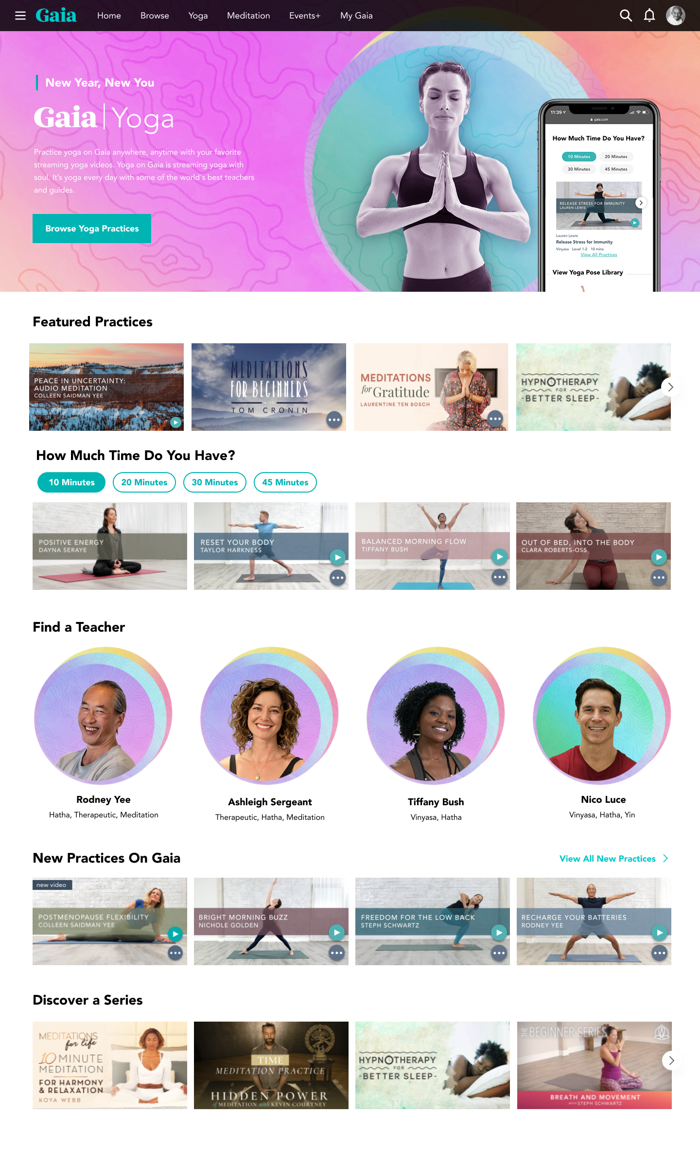
Our product team had been unhappy for quite some time with our user interface; internally we all agreed it was stale and cumbersome. As the primary challenges became crystal clear, UXD began outlining potential concepts to test, and built a responsive prototype in Figma to share with our user community.
Design Work
We purposely tried to keep our approach “easy” to develop. We engaged early on with engineering, so as to create design concepts that could be implemented without impact to our current front-end architecture. We wanted to be sure we could create a solution that was both engaging to users and inexpensive to build.
TESTING & ITERATION
Our findings were overwhelmingly positive – 28 out of 30 test subjects were able to successfully complete all the required tasks of our testing script with zero prompting or assistance. All participants responded positively and praised the aesthetics and ease of use of our new designs.
Our research findings enabled us to convince key stakeholders (read: executive leadership) that this enhancement would not only address usability issues, but would also be critical to addressing issues with membership churn and lack of growth.